Seaborn is a Python visualization library based on Matplotlib that provides a high-level interface for drawing attractive and informative statistical graphics. It is particularly useful for exploring and understanding data.
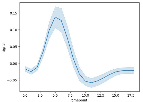
fMRI: Functional Magnetic Resonance Imaging (fMRI) datasets capture brain activity by detecting changes in blood flow, often used in neuroscience research to study brain functions.
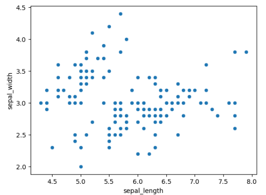
Iris: The Iris dataset contains measurements of sepal length, sepal width, petal length, and petal width for three species of iris flowers, commonly used for classification and clustering tasks in machine learning.
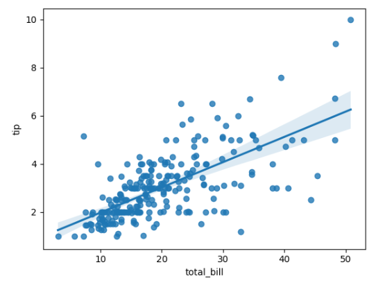
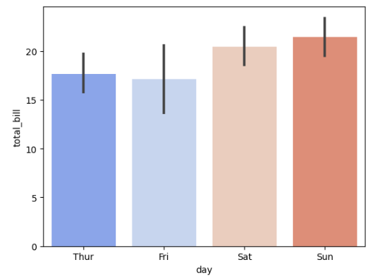
Tips: The Tips dataset records information about tips given by customers in a restaurant, including total bill, tip amount, sex of the bill payer, day, time, and size of the dining party, often used for statistical analysis and regression.
Flights: The Flights dataset includes details about flights, such as departure and arrival times, delays, airline, and flight number, commonly used to analyze and predict flight performance and delays.
pip install seaborn
lineplot function. Here's an example:
import seaborn as sns
import matplotlib.pyplot as plt

# Sample data
data = sns.load_dataset('fmri')

# Create line plot
sns.lineplot(x='timepoint', y='signal', data=data)

# Display the plot
plt.show()
scatterplot function. Here's an example:
import seaborn as sns
import matplotlib.pyplot as plt

# Sample data
data = sns.load_dataset('iris')

# Create scatter plot
sns.scatterplot(x='sepal_length', y='sepal_width', data=data)

# Display the plot
plt.show()
palette parameter. Here's an example:
import seaborn as sns
import matplotlib.pyplot as plt

# Sample data
data = sns.load_dataset('tips')

# Create bar plot with custom palette
sns.barplot(x='day', y='total_bill', data=data, palette='coolwarm')

# Display the plot
plt.show()
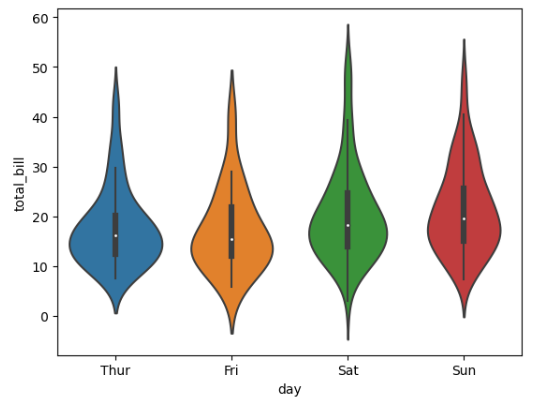
import seaborn as sns
import matplotlib.pyplot as plt

# Sample data
data = sns.load_dataset('tips')

# Create violin plot
sns.violinplot(x='day', y='total_bill', data=data)

# Display the plot
plt.show()
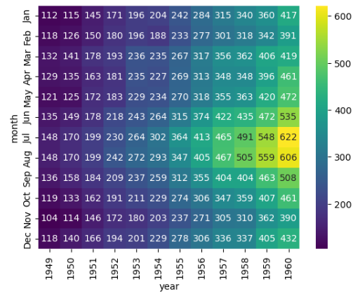
import seaborn as sns
import matplotlib.pyplot as plt

# Sample data
data = sns.load_dataset('flights')

# Create heatmap
heatmap_data = data.pivot_table(index='month', columns='year', values='passengers')
sns.heatmap(heatmap_data, annot=True, fmt="d", cmap='viridis')

# Display the plot
plt.show()
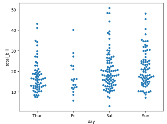
import seaborn as sns
import matplotlib.pyplot as plt

# Sample data
data = sns.load_dataset('tips')

# Create swarm plot
sns.swarmplot(x='day', y='total_bill', data=data)

# Display the plot
plt.show()
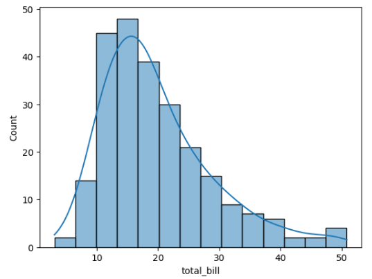
distplot function. Here's an example:
import seaborn as sns
import matplotlib.pyplot as plt

# Sample data
data = sns.load_dataset('tips')

# Create distribution plot
sns.histplot(data['total_bill'], kde=True)

# Display the plot
plt.show()
regplot function. Here's an example:
import seaborn as sns
import matplotlib.pyplot as plt

# Sample data
data = sns.load_dataset('tips')

# Create regression plot
sns.regplot(x='total_bill', y='tip', data=data)

# Display the plot
plt.show()