1. Scatter Plots
Scatter plots are used to observe the relationship between variables. Each point represents an observation.
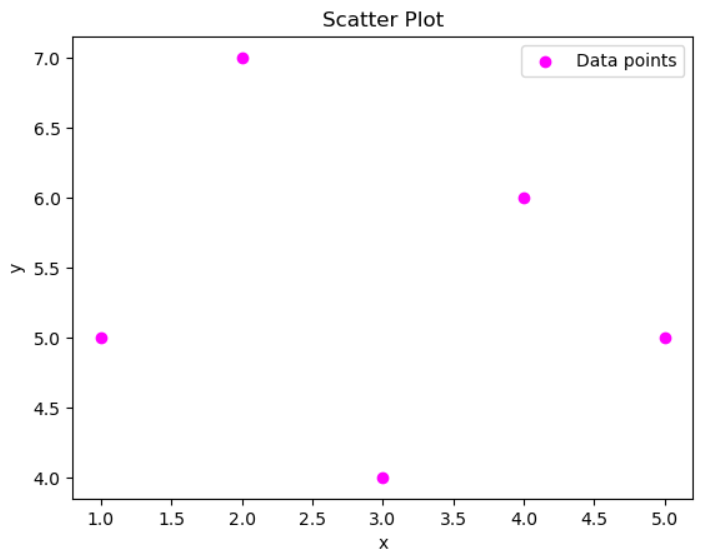
import matplotlib.pyplot as plt

x = [1, 2, 3, 4, 5]
y = [5, 7, 4, 6, 5]

plt.scatter(x, y, color='magenta', marker='o', label='Data points')
plt.title('Scatter Plot')
plt.xlabel('x')
plt.ylabel('y')
plt.legend(loc='upper right')
plt.show()
Question: What does each point in a scatter plot represent?
Answer: Each point in a scatter plot represents an observation, showing the relationship between the x and y variables.